To continue our post on how to make your money grow, we left off speaking about the importance of market conditions. Assessing market conditions is linked very closely to the time frame that you’re comfortable trading. There is a tremendous need for self-awareness required to invest successfully. The more honest you can be with yourself, the better equipped you will be to actually make money. Your primary goal as investors is to make money, your secondary goal is to enjoy the process.
In an effort to determine investment suitability for their clients, most Investment Advisors will ask three questions:
- What is your Risk Tolerance?
- What is your Investment Objective?
- What is your Investment Time Horizon?
For the average investor who has a ‘retirement’ goal, the date of their retirement is the actual time horizon for the overall portfolio. Since our goal is to empower you to either a better understanding, or better action, we’re digging a little deeper into the “time” component. We’re hoping to help you look at the market in a way that won’t cause you to absorb too much risk (i.e.- “ahhhh, I’ve got 30 years… I’m not worried what happens!”), or too little in the sense that you’re looking at it all the time and jumping out at the first sign of a possible direction change.
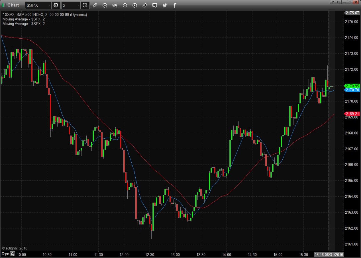
In no way am I encouraging our readers to daytrade, or use very short time frames, but I’m including this look for illustrative purposes. To get an idea of what two different time frames might “feel” like, have a look at the two charts below. The first is a 2 minute chart of the S&P 500, which illustrates a full day of trading, from 09:30 am – 4:00 pm. Each bar that you see represents 2 minutes of trading activity. The ‘major’ trend reversed around 12:30. If you were trading this market short and went out for lunch without stops in place, you would have had a very different view when you returned.

S&P 500 2 Minute Chart

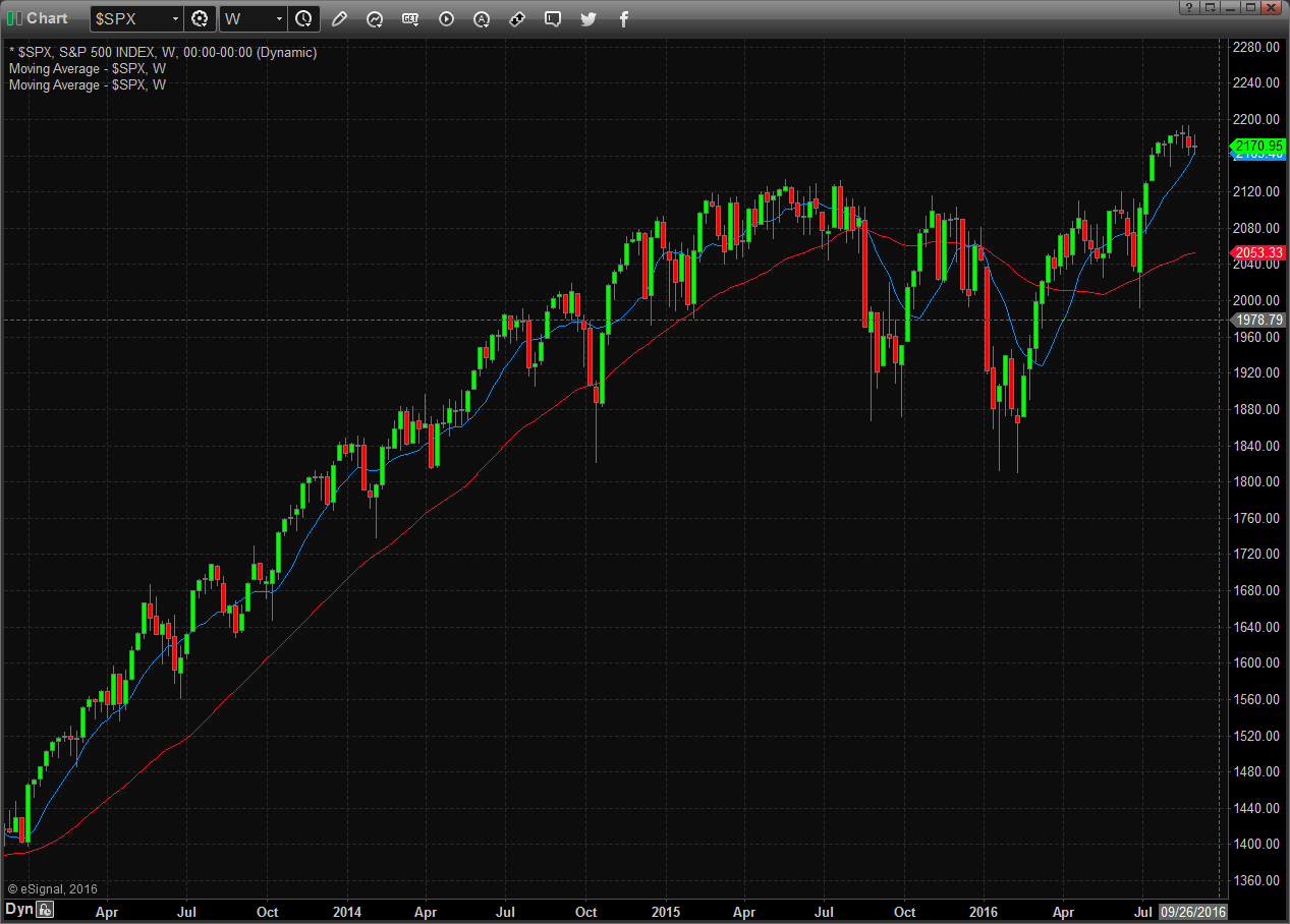
S&P 500 Weekly Chart
The second chart is a Weekly snapshot of the S&P 500, where each bar you see represents one week of trading activity. We see slightly more than three years of data before us, most of which represents a very strong upward trend. The person who trades this time frame had very good returns until the first quarter of 2015 and has only recently begun to grow their account again.
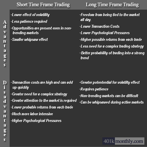
The following matrix may help you to understand some of the relevant factors for each time period. You’ll see how personal the decision can be. If you’re an adventurous, Type-A personality and plan on actually trading for yourself, then a longer term time frame will be very difficult for you. You will most likely find it incredibly boring and have difficulty being patient with most profitable long-term strategies.

If you are trading in an account outside of your 401k, understanding your time frame is extremely important. For the average investor, working from the weekly chart will cut out much of the noise and still be sensitive enough that you can reasonably manage the risk against a large loss. For our purposes here, since we’re primarily dealing with 401k’s, there is no option for trading short to very short time frames. It’s also important to understand that perhaps one of the best secondary benefits to trading the right time frame with the right strategy is not only making money, but also being able to sleep at night in tough markets. If this all seems complicated and you simply want to be educated about the process but spend the bulk of your efforts focusing on your career, you may want to consider a low cost subscription to our newsletter.
Have you ever considered time frame or examined a strategy to manage volatility in your portfolio?


